Qualcosa bolle in pentola! Nuovo logo BARILLA, versione più minimal con un rimando al passato.
Something is cooking! New #barilla logo, more minimal version with a reference to the past.
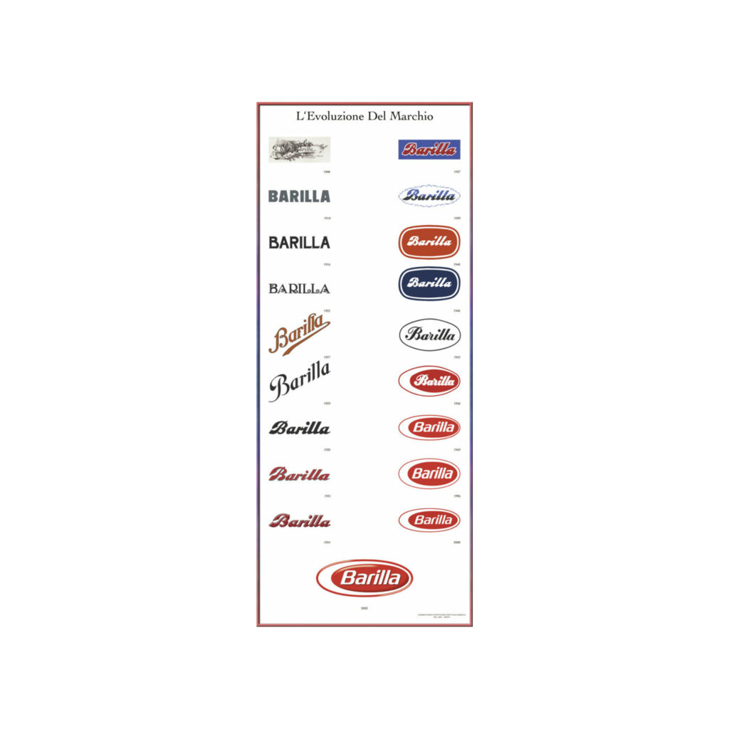
The most famous #pasta company in the world has unveiled the new brand: the white goes away while the red remains but of a more intense shade and with the wording of the foundation date, that is 1877, on it. The #font remains in italics but little differs from the previous one. The old #marchio was made by Eberto Carboni and was the representation of a boiled egg cut in half. In fact, the shape of the new #logodesigns remains similar, but as mentioned, the white disappears.
Also in 2020 there was a small change: goodbye to the classic blue, in favor of a blue that recalled the shades of our national team, the blues (I add closer to the cousin brand #voilello), all this is supposed in view of the very successful European championships. which as we know because #covid were held last summer, and which marked the triumph of Roberto Mancini’s boys.
In conclusion, we at vekstudio like the new brand very much, it is even more legible in its small dimensions, and perhaps it refers us to the #pompeian red color, the undisputed chromatic symbol of our Campania history.